Record Store Logo
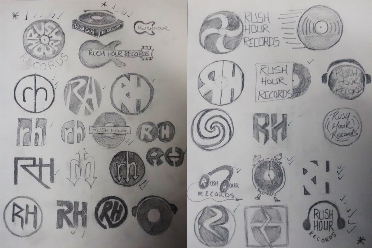
sketches
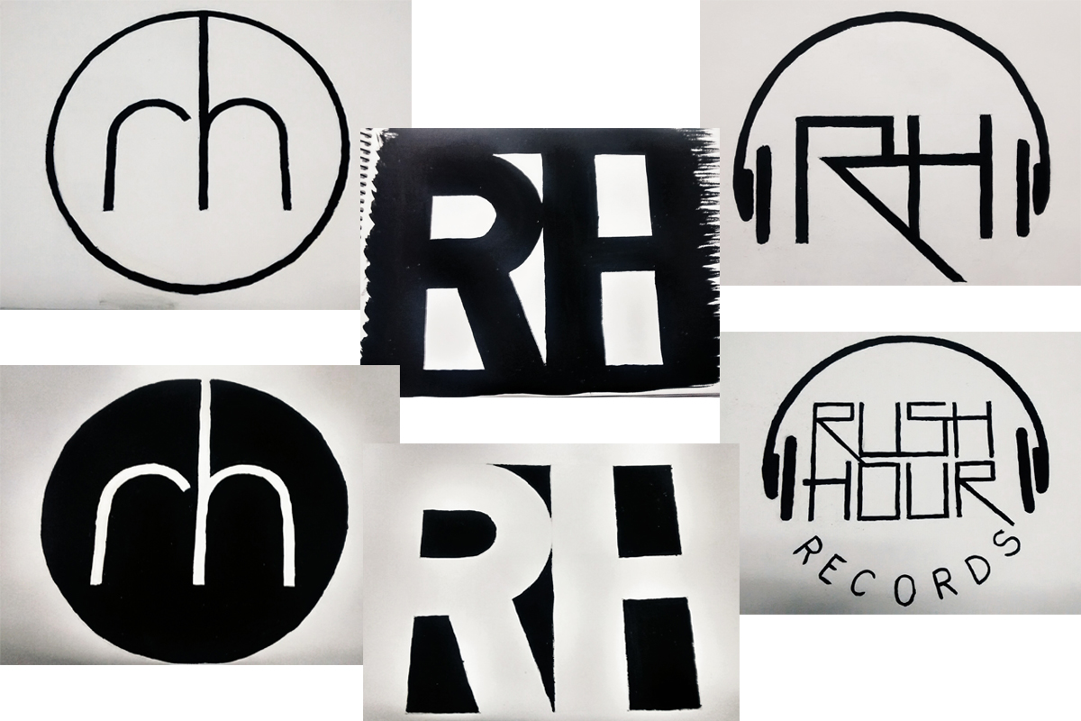
guache
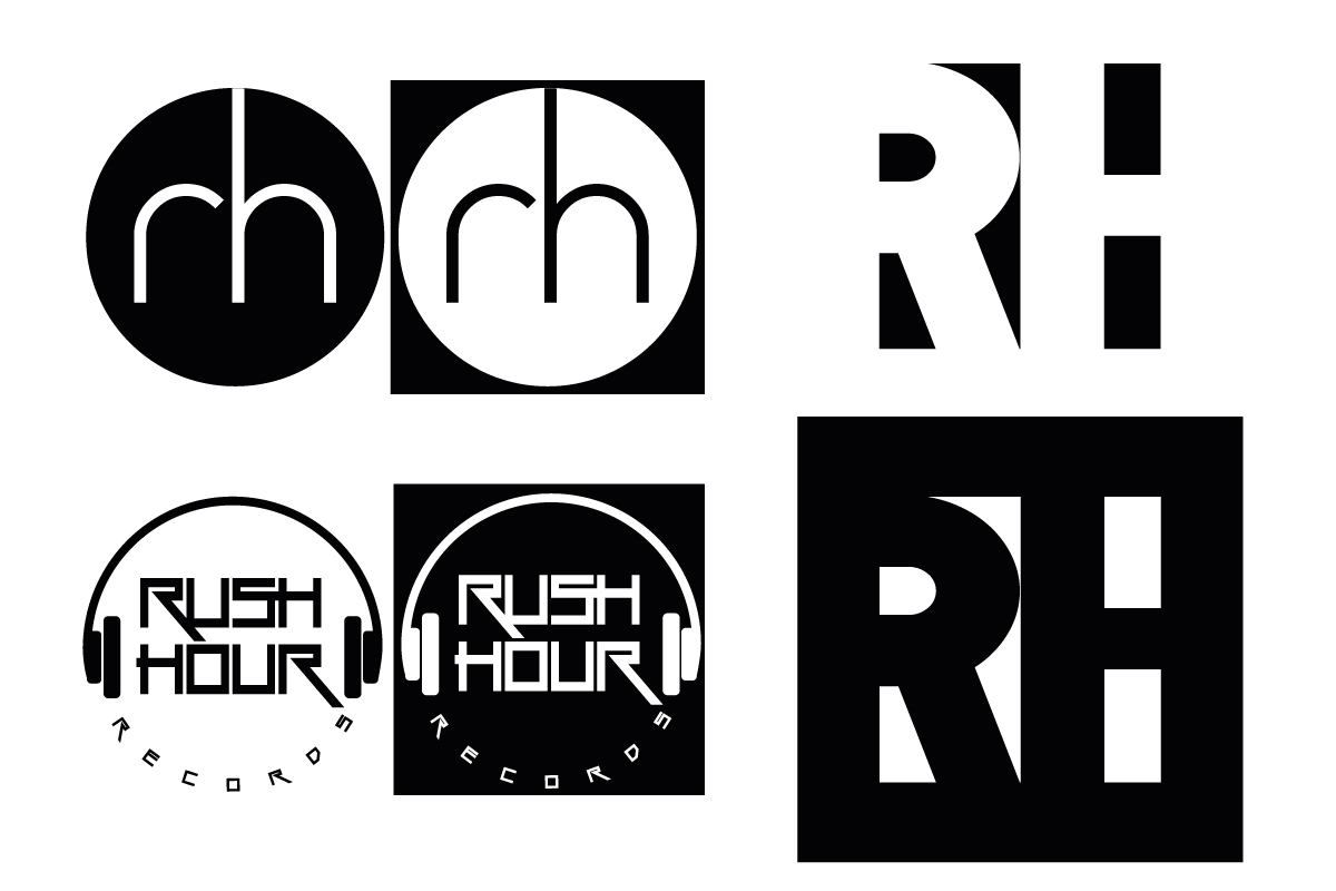
vectored logos
Rush Hour Records Logo

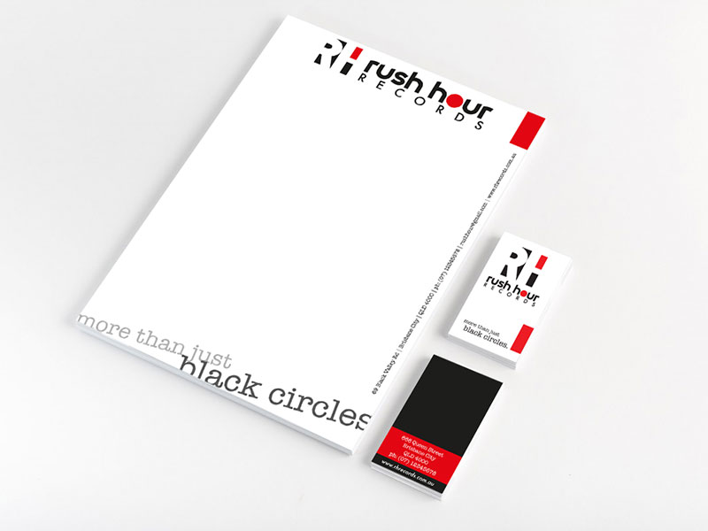
Stationery
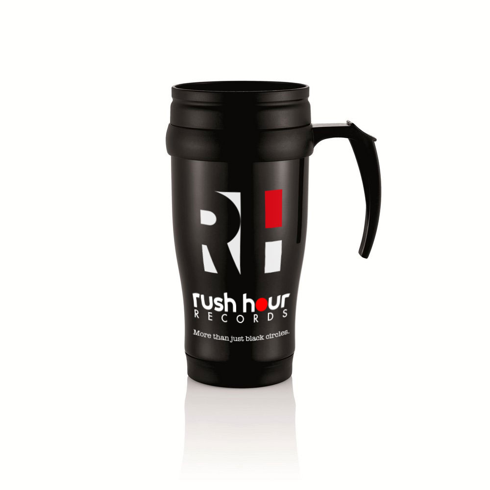
travel mug
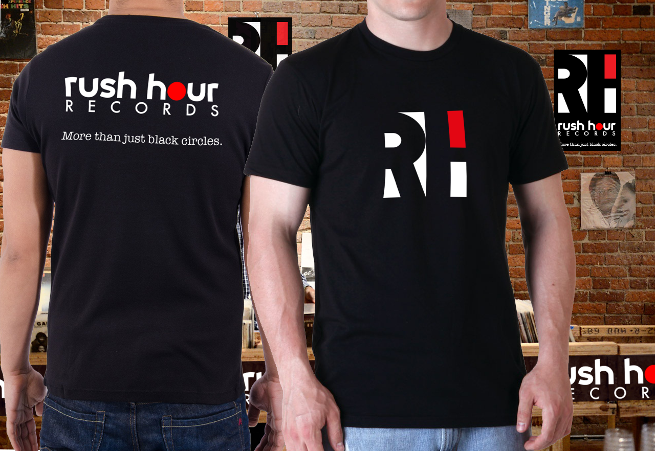
team uniform
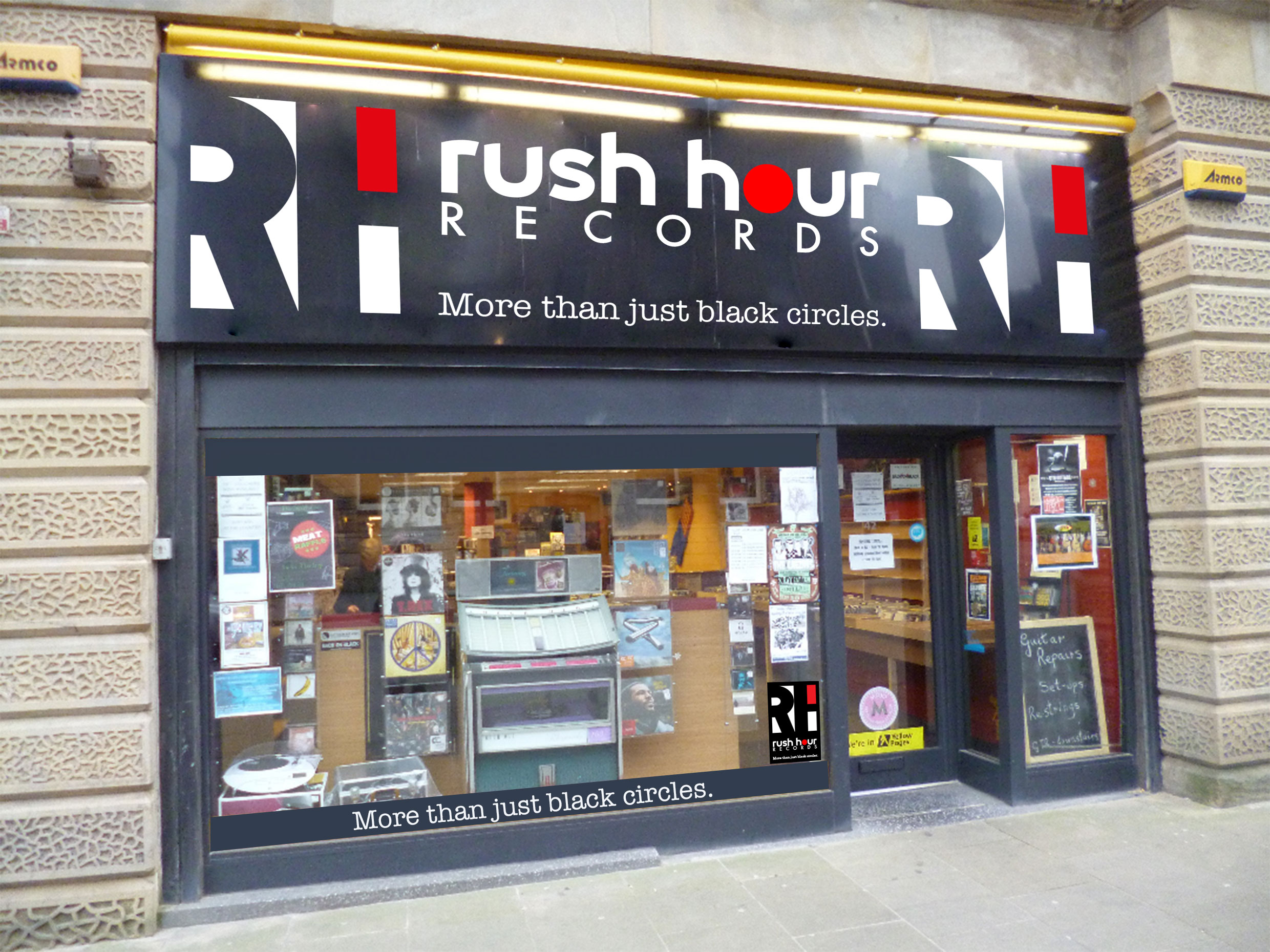
shop front
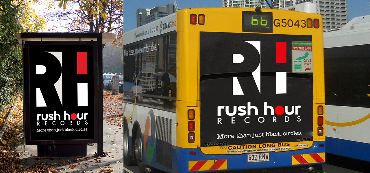
Metro Advertising
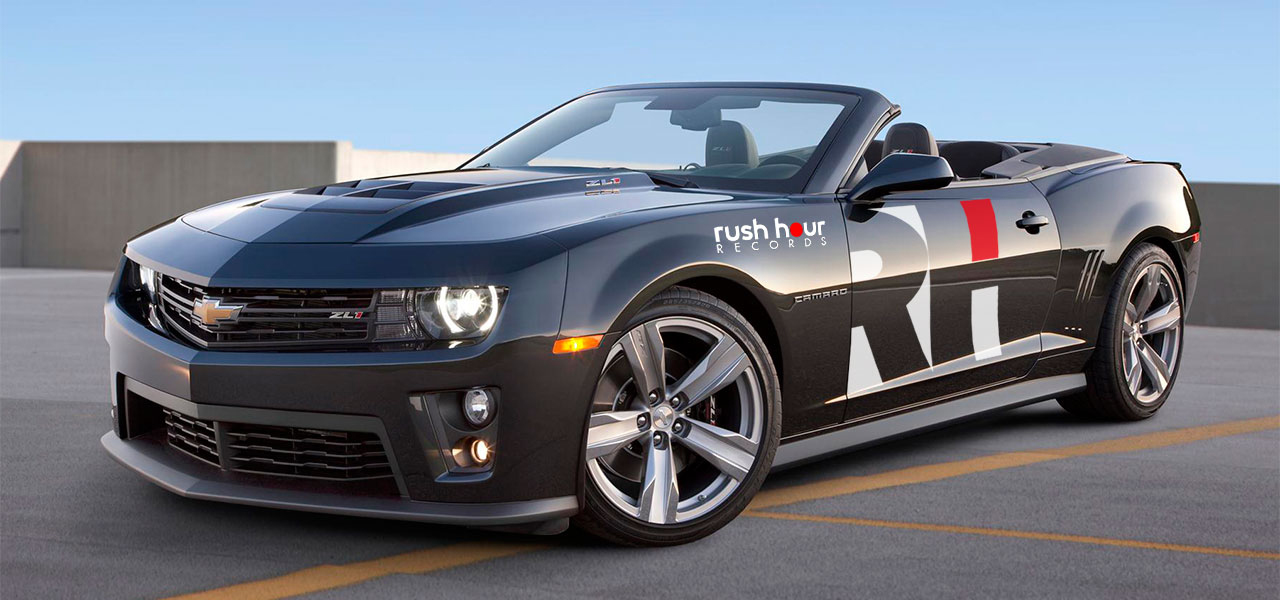
Vehicle wrap
About This Project
[vc_row row_type=”row” use_row_as_full_screen_section=”no” type=”full_width” angled_section=”no” text_align=”left” background_image_as_pattern=”without_pattern” css_animation=”” css=”.vc_custom_1456153502843{padding-bottom: 10px !important;}”][vc_column][vc_column_text]
Rush Hour Records
[/vc_column_text][vc_separator type=”transparent” thickness=”0″ up=”30″ down=”0″][vc_column_text]
Problem Statement:
Design the new record store logo for a hardcore/alternative music store for young musicians.
Client profile:
Rush Hour Records opened in 1988 in a small inner city store and have grown into what is now Brisbane’s busiest independent music store.
They stock the largest range of Hard Rock, Progressive, and Extreme Metal Music, and can source any specicfic item for clients on request.
They also stock a large range of movie DVDs, T-shirts, posters, stickers, and retro collectors items.
Aims and Objectives:
To create a new logo representative of the style and image of the store and it’s clientele.
Design must be edgy and bold enough to stand out from the crowd, and be suitable for use on Black T-shirts and stickers.
Process:
I started by researching competitors logos, which were typically black and round. I then started sketching 30 ideas on paper, and selected 3 options which I painted in guache and presented to the client for feedback.
As Rush Hour records is more than just a record store, the final logo uses negative space in a square frame, which stands out against the sea of black circular logos used by competitors, and I added the tagline “more than just black circles” to affirm the clients objective.
Summary:
The final record store logo design has succeeded in meeting the client brief, it is bold, stands out from the crowd, and is able to be applied to a black or white backround. The tagline is also edgy and a great positioning statement for the company style and branding.
This was my first project as a graphic design student, so I hope you like it. Feel free to check out some of my other designs.
Back to Crispian’s Graphic Design Portfolio[/vc_column_text][vc_separator type=”transparent” thickness=”0″ up=”37″ down=”0″][/vc_column][/vc_row]
Date
February 22, 2016